Navigating Causal Inference
In the previous post, we discussed the influence of marketing optimization to the field of causal inference. It’s actually part of a much larger phenomenon that makes causal inference unique, as the intersection of various scientific domains. Whether marketing or epistemology, clinical trials, socio-economics and econometrics or the modern data-driven tech fields, they all care for cause identification or effect estimation. A good example of making explicit such mappings can be found in the 2016 paper Causal Inference and Uplift Modeling.
For instance whether the ultimate goal is to build prescriptive policy (what treatment should we give in the future, either globally or locally to a group or even an individual) or make retrospective estimation (what was the impact of a given event that isn’t necessarily controlled). Another crucial distinction is the relationship with experiments, sometimes they are not possible at all (for ethical reasons as in clinical trials) and sometimes treatment allocation can be fully controlled (marketing campaign for e-commerces).
This makes for a very diverse literature with different motivations, settings and objectives or even notations. Thankfully, Brady Neal put it nicely in this flowchart
This comes at a price for the non initiated trying to study causal inference. A price I didn’t realised I had to pay until much later in my causal journey. Probably because I made the choice to read (a bit of) all the suggested books. To show examples of this, I’ll present two situations that took me quite some time to realise.
Who owns the Treatment Assignment?
For instance, while working at Dataiku we designed a visual causal ML suite which targeted non experts (think business analyst or subject expert matter). Because of this audience, we wanted to provide guardrails to ensure the validity of causal hypothesis1.
One of those is the so-called positivity or overlap hypothesis. Very simply put, this states that there is no subspace where units only receive treatment or control. If \(X\) is our set of observed features and \(T\) the treatment:
\[\forall x, 0< \mathbb{P}(T=1 | X=x) <1\]To check this hypothesis validity, various classical methods exists such as analyzing propensity scores that relies on training machine learning models for \( \mathbb{P}(T=1 | X=x)\).
However if we can control for treatment allocation, say because we decide who gets the discount, we don’t need to build a model for it. And Dataiku’s customers are very likely to fall in that category so that we could simply ask of them to provide the treatment allocation mechanism. It took us quite some time to understand this. Probably because in the textbooks we learnt from, this was never presented as such.
If this oracle propensity helps for the evaluation of positivity, it’s another story for effect estimation. Indeed, propensity scores can also be used directly in building causal models for presciptive policies. Not only that, and perhaps quite surprisingly, estimated propensity scores can lead to better properties than oracle ones for evaluation of average treatment effect2.
Who needs causal graphs anyway?
The impact of those different background to causality is perfectly highlighted by the two main approaches or perhaps languages: the potential outcomes, associated with Donald Rubin, and the causal graphs, associated with Judea Pearl who is arguably a bit of a dag.
Even though they are theoretically equivalent, the graphical approach seems to not be widely used in fields like social and environmental science. For a more in-depth presentation and analysis of those approach, there is a great review paper by no other than Economy Nobel prize recipient, Guido W. Imbens.
After starting a PhD in Econometrics at Brown, Jean-Yves Gérardy joined the data science team I was a part of and started to spread the gospel by organising a causal inference seminar back in 2016. We learnt about do-calculus (Pearl’s theory) and the importance of careful adjustments for valid effect estimations. The collapse of the Simpson paradox through the backdoor criterion, all of that through the causal graph lens, left an important impression on me. This gave birth to Dataiku’s first research paper: Causal Inference and Uplift Modeling.
A few years later, we were ready to take up the torch and convert our data science community to the benefits of causal inference. We looked for a business situation where a reasonable data scientist would include bad controls in his model - i.e. opening backdoor paths - which would ultimately gives biased effect estimation However for an uplift use case, it would amount to control on post-treatment features (as children of treatment, which clearly are bad controls) but no reasonable data scientist would include in his model or it will seriously leak. Here is an example of such graph:
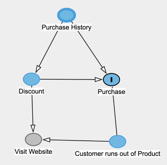
This might be a valid graph but “Visit Website” occurs after “Discount” so we wouldn’t control for it and including it in our model would introduce leakage
So with just some data science common sense, there is no need to build a graph here to avoid a biased estimation. Yes, we were so seduced by the elegance of the graphical approach that we really wished to use it… And for such causal effect estimation tasks, graphs remains a great visual tool that clearly encapsulate all of our hypothesis, whether explicit or not.
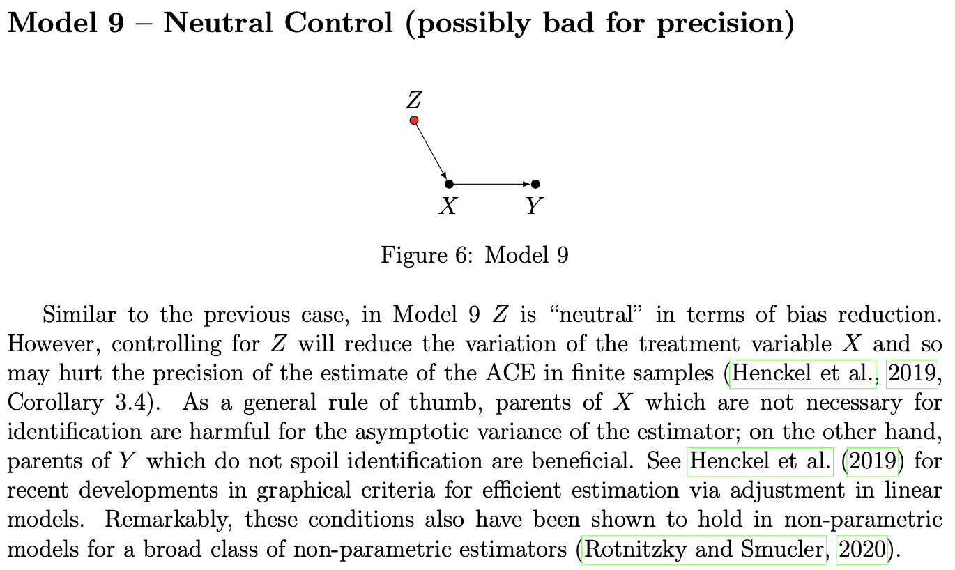
For a thorough but compact review of the impact of adjustment for different types of graphs, be sure to check out Cinelli’s A Crash Course in Good and Bad Controls, though I’m not sure I understand the arguments presented under Model 9 below
Positivity Detection == Drift Detection
We have spent a few years thinking about drift detection methods and causal inference hypothesis testing (independently) without making that connection. They are the same thing, they just don’t dress alike.
It was a very latent intuition for quite a while that I’ve turned away as it felt like a case of pareidolia: you see everywhere what you saw somewhere. Like a terrible machine learning model that gives constant predictions.
 Do you see it?
Not only this holds true, but this is nothing new. Worst perhaps, I’ve read papers already mentioning this connection but didn’t pay enough attention. Probably as early as Johansoon’s 2016 Learning Representations for Counterfactual Inference… as its first contribution:
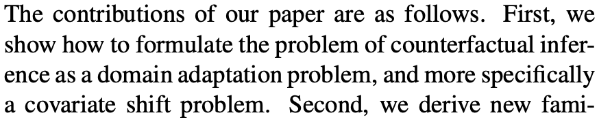
Indeed, I was at the time more interested in their new algorithmic framework for causal estimation. The connection is made even clearer in 2019 by the same authors, in Generalization Bounds and Representation Learning for Estimation of Potential Outcomes and Causal Effects from which the following is extracted.
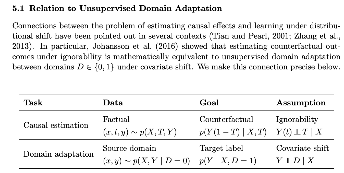 Causal Estimation & Domain Adaptation
This realisation allows to transfer our work in one field to the other, and this is exactly what we did at Dataiku for our first positivity detection methods was based on our drift detection toolbox. This can be summarized as:
T, treatment ↔ D, domain
Propensity/Positivity Test ↔ Domain Classifier Test
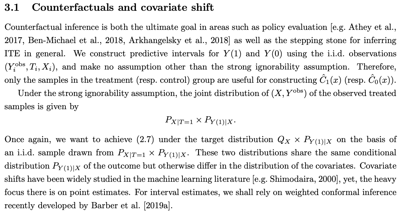
Another example of cross fertilization between the two domains can be found in Conformal Inference of Counterfactuals and Individual Treatment Effects(Lei, 2020) which leverages conformal predictions under covariate shift to provide uncertainty bounds for individual treatment effect estimation.
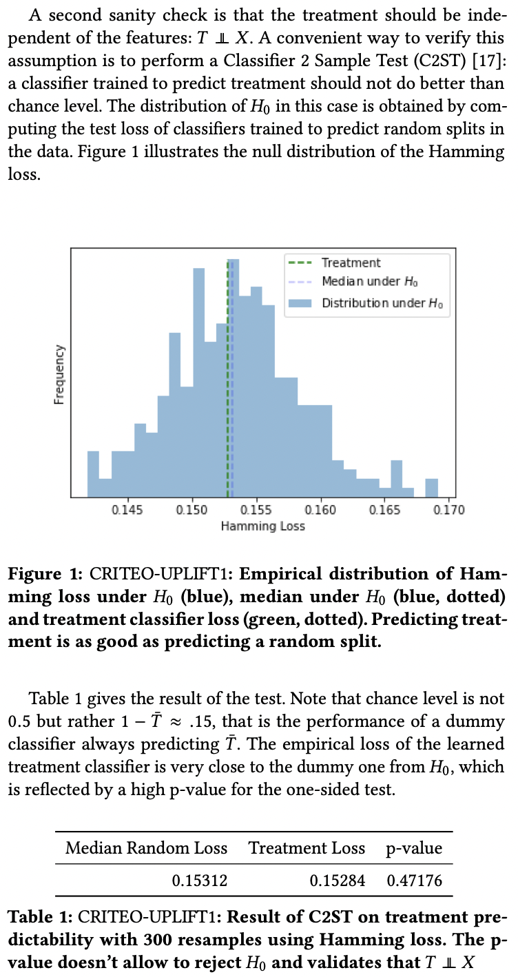
In the Criteo dataset paper, the author use an analog of the Domain Classifier to test for randomness of the treatment allocation in an experiment, but with two interesting twists.
- Instead of learning one (propensity) model on all available data before testing its accuracy, they randomly split the data many times to learn the null-hypothesis distribution of the model performance. They then compare this distribution to the actual split of the data (T=0 vs T=1).
- The second twist is that each bootstrap sample is surprisingly small, 300!
-
Check out Jean-Yves Gérardy’s blog post for an introduction to those hypothesis and their importance. ↩
-
See the Efficient Estimation of Average Treatment Effects Using the Estimated Propensity Score paper that I haven’t actually read. Note: This is actually a more general phenomenon, see Assessing the Accuracy of the Maximum Likelihood Estimator: Observed Versus Expected Fisher Information. ↩